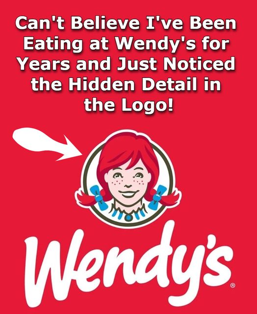
Anyone familiar with Wendy’s knows the freckle-faced redhead in its logo — a symbol of comfort and nostalgia for fast-food fans.
When founder Dave Thomas opened Wendy’s in 1969, he modeled the brand after his daughter, Melinda Lou “Wendy” Thomas, capturing her wholesome, friendly spirit. “He wanted a character,” Wendy recalled. “He said, ‘Wendy, pull your hair up in pigtails.’ He took pictures and said, ‘Yep, it’s going to be Wendy’s Old-Fashioned Hamburgers.’”
Over time, the menu and logo evolved, with subtle updates keeping the redheaded girl timeless yet modern. A 2013 redesign softened her features and refreshed the lettering while preserving the nostalgic charm.
Eagle-eyed fans later noticed what seemed like the word “mom” hidden in Wendy’s frilled collar — a supposed subliminal nod to home-cooked comfort. Though Wendy’s confirmed it was unintentional, the association with warmth and family values remains central to the brand.
What do you think of the “mom” illusion in the Wendy’s logo?